INDUSTRY:
FINTECH / REMITTANCE
COMPANY:
NANOPAY
YEAR:
2023-2025
ROLE
UX DESIGN, FRONT-END
Foree Remittance
I led the end-to-end design of Foree Remittance, a cross-border money transfer product for Canadians sending money to Pakistan. Foree was built on nanopay's payment infrastructure and positioned as a modern alternative to wire transfers: faster, cheaper, and more transparent. I owned design from initial user research through the core transfer wizard through to shipping the product in 2024.
challenge.
The global remittance market is evolving rapidly, with a growing need for efficient and user-friendly solutions. While local money transfers have been brought into the 21st century with products like Interac e-Transfer and Zelle, foreign remittances are still difficult to navigate. Foree was born out of a recognition for the need of a remittance solution that utilises the advancements in local remittances and brings them to the global stage. I talked to 6 Pakistani-Canadian adults aged 25-40 during research and ran competitive analysis across Remitly, Western Union, Wise, and bank wire transfers. Four pain points came up consistently.
Pain Points using Conventional Money Transfer
High costs: Sending money across borders through international wire transfers and remittance services often incurs high fees, placing a financial burden on end users.
Slow transactions: Traditional cross-border payments may take several days or even weeks to finalize, posing challenges for users in need of swift transactions.
Opaque processes: Conventional banking systems can lack transparency, making it difficult to monitor transaction status or comprehend the associated fees.
Complicated regulatory landscape: Maneuvering through the intricate network of international regulations can be overwhelming.
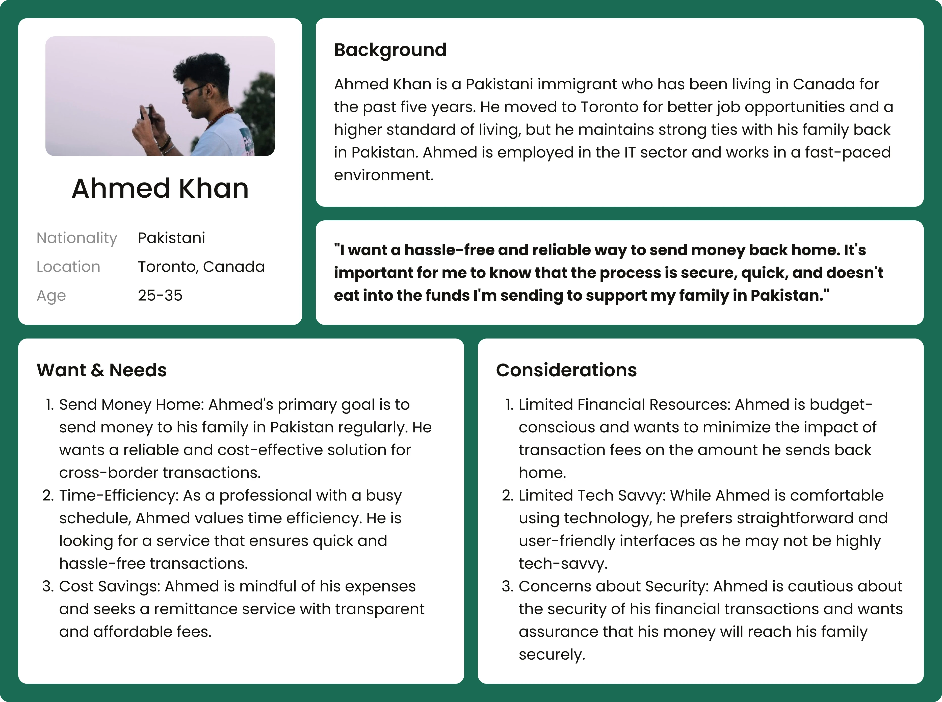
Persona
process.
I led design on Foree across research, IA, interaction, and visual direction. The early work happened mostly outside Figma. The Interac e-Transfer integration constrained the user flow in ways that weren't obvious until I sat with the engineering leads and walked through the API. Most of the consequential decisions came out of those sessions.
Information Architecture
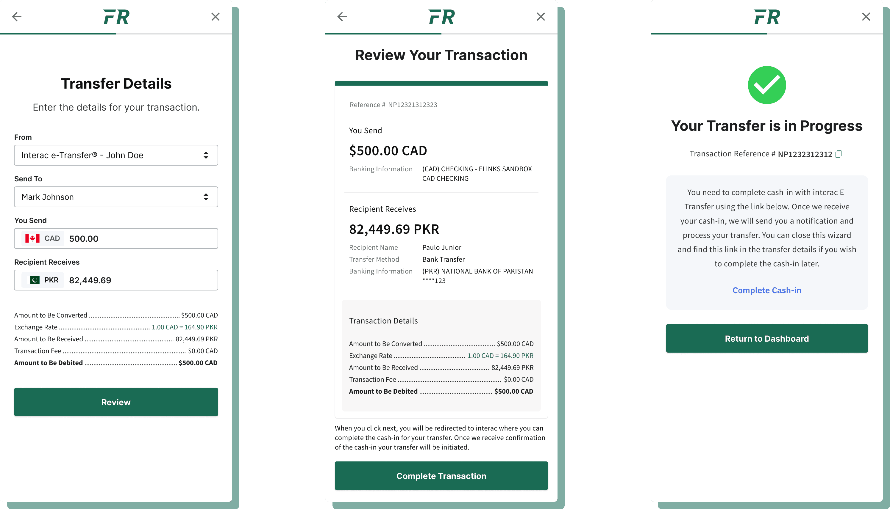
I mapped the full transfer wizard flow, landing page, account management, contact management, and transaction history. The transfer wizard was the most complex part: it involved Interac authentication, recipient management, live exchange rate display, and schedule configuration across multiple decision points.

The IA work surfaced a problem early. The Interac cash-in step was technically required after the user had confirmed the transaction in Foree's system, but users would expect payment to feel like one action. That mismatch became the central design challenge of the project.
key design decisions.
The Interac Cash-In Problem
Foree used Interac e-Transfer as its funding rail due to its low cost and near instant processing, but this meant users had to complete a separate step in their bank's app after creating the transaction in Foree.
The initial design showed a "Your Transfer is in Progress" screen with a "Complete Cash-In" link. Users thought they were done. The green checkmark and "in progress" language gave false confidence. Three of six test participants closed the app before completing the Interac step. Their money never moved.
V1: Initial design tried to imitate competitor products in order to maintain existing mental models
Second iteration: I reframed the screen as "Awaiting Funds..." with a spinner and step-by-step instructions. This tested better, but users found "awaiting" was taking too long as might be the case with API calls. They felt like something had gone wrong.
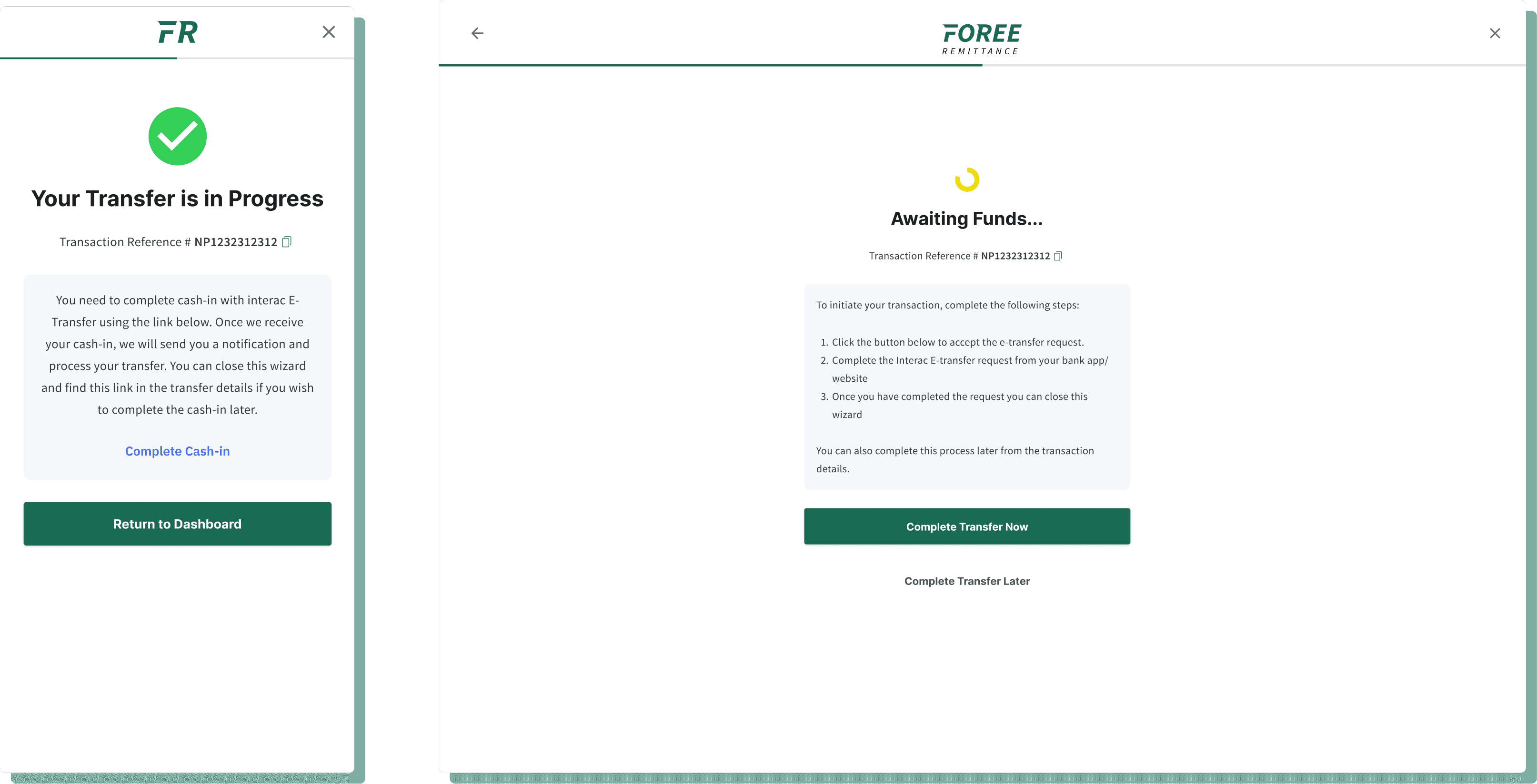
V2: We tried to make the steps clearer. Adding more indication of progress but it did not work as well as we expected.
Final version: a screen titled "One more thing..." with the Interac logo and a single primary action, "Complete Transfer Now." Secondary copy explained that the transfer wouldn't process until this step was done. A "Complete Transfer Later" option let users return to it from the transaction detail view if they needed to step away.
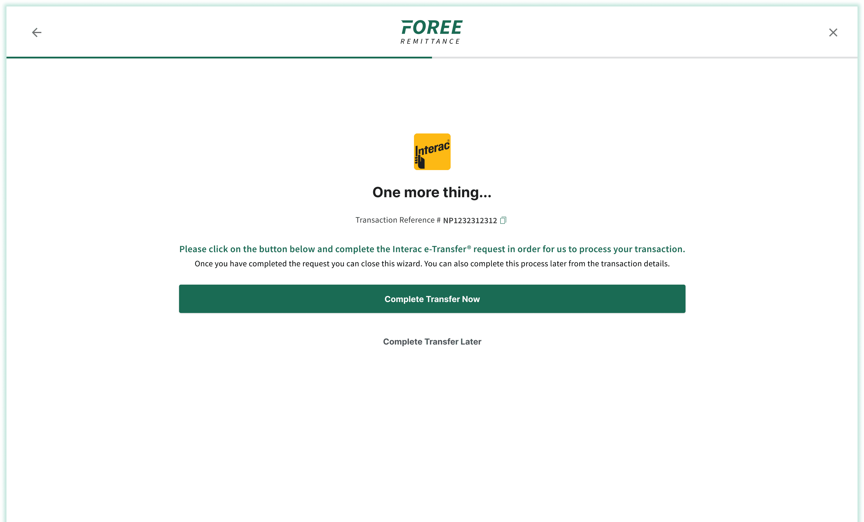
Post-change, zero participants abandoned before the Interac step.
Exchange Rate Display
Users needed to trust the exchange rate before confirming a transfer, but rates fluctuate. I designed a prominently displayed live rate (1.00 CAD = X.XX PKR) with a full transaction breakdown showing what gets converted, the fee (Foree's $0 fee was a key differentiator), and the final debit amount. These users had been burned by hidden fees before. Showing every number before they committed was the only way to earn the transfer.
Dashboard
The home screen led with the live exchange rate front and centre. This was a deliberate hierarchy decision: the exchange rate is the first thing a user checks before deciding to send money. Making it the first thing they see reduced steps to transfer initiation and anchored the product in what it was actually good at.
Brand Direction
Foree's visual direction was kept distinct from nanopay's corporate palette. A green-forward identity, nodding to both money and Pakistani natural imagery, with a two-tone FR mark that worked across app icons and loading states. The product needed to feel trustworthy and warm. A remittance product is about sending support to family, not executing a financial transaction.
results.
Foree shipped in January 2024. The "One more thing..." screen became a reference internally for how language and framing can work around a technical constraint without an engineering fix.
Here is a user review shortly after launch:
“This is an easy to use app with a quick setup and navigation. Clean layout for an average user like me. The rates on this app are the best so far I have got on any remittance platform. You can quickly deposit with interac and transfer is fast.”

