INDUSTRY:
FINTECH / PAYMENTS
COMPANY:
NANOPAY x INTUIT
YEAR:
2022-2024
MY ROLE:
UX DESIGN, FRONT-END DEVELOPMENT
Bank Payments for Intuit QuickBooks
nanopay worked with Intuit to add bank payments to QuickBooks. The idea was straightforward: let payers pay merchants directly from their bank account without leaving QuickBooks, cutting transaction fees and shortening account receivables for merchants.
I was the UX designer and front-end developer on nanopay's side, responsible for the end-to-end payer experience and part of the front-end implementation.
challenge.
Bank payments benefit merchants more than payers. Payers have credit cards, which are fast, familiar, and reward them. The bank payment experience had to be at least as easy as the credit card flow, ideally easier. Credit card payment on QuickBooks takes a few fields and a button. We had to match that.
The complication:
Bank payments come with compliance and technical requirements credit cards don't. We needed the payer's account and transit numbers, or a way to fetch them. Canadian payers were also more familiar with Interac e-Transfer than with bank payments as a concept. Our beachhead was B2C payers above the $3,000 Interac limit, who were the most underserved segment by existing options.
Research with merchants surfaced what was at stake:
"It's really important for us to shorten our accounts receivable. If this tool helps us do that, we'll keep using it. If it doesn't, we won't."
process.
I worked with nanopay's PM to identify the major design considerations before starting screens. Four things shaped the direction: the experience had to be as simple as the credit card flow, compliance requirements made that hard, Canadian payers weren't familiar with bank payments as a concept, and the B2C segment above $3,000 had the most to gain and the least friction to overcome.
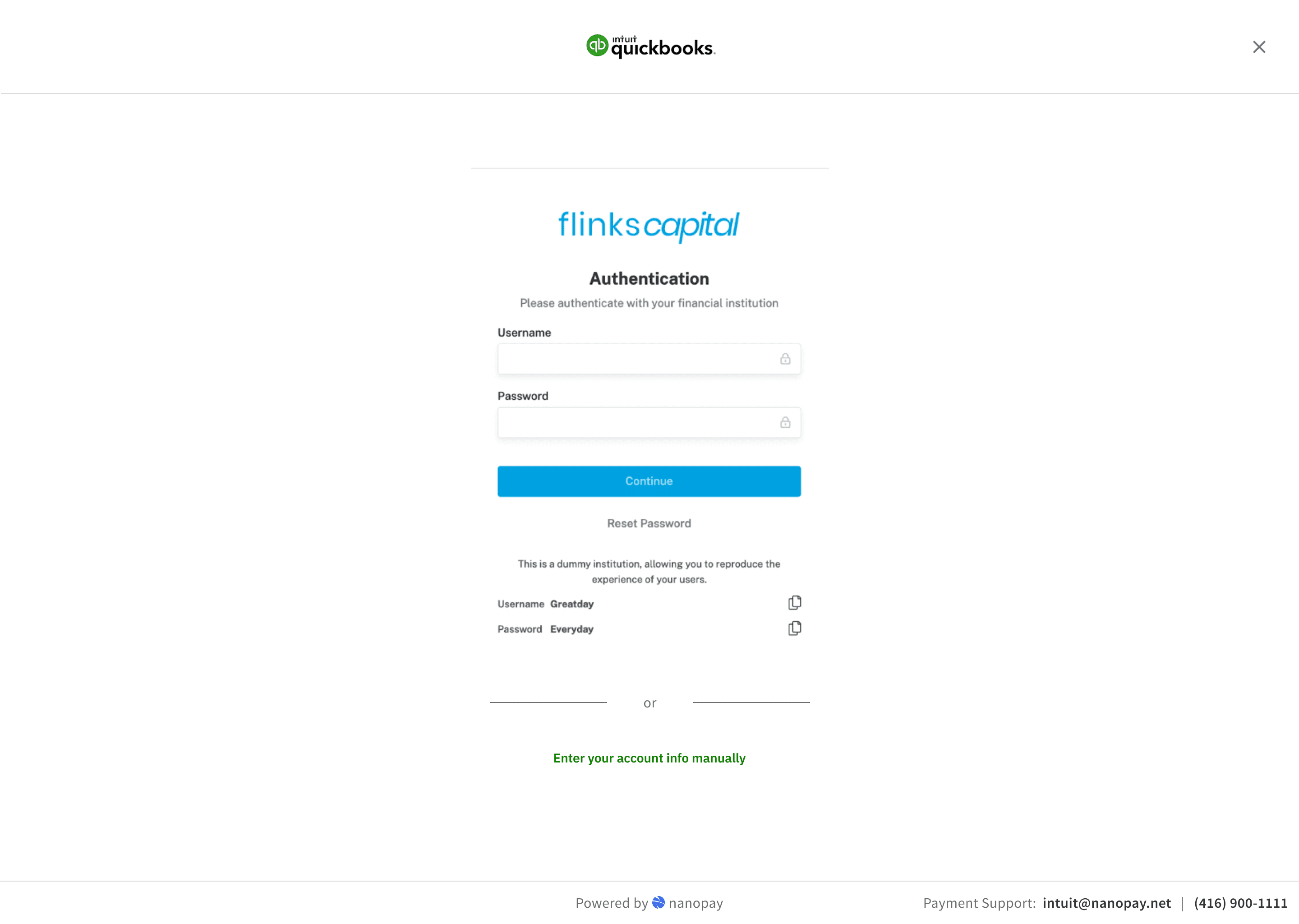
The solution used a third-party service, Flinks/Plaid, that captured bank account data by having payers log into their bank directly. When it worked, the experience was fast and clean. However, this was rarely the case with the service regularly taking a few minutes as opposed to a few seconds.
key design decisions.
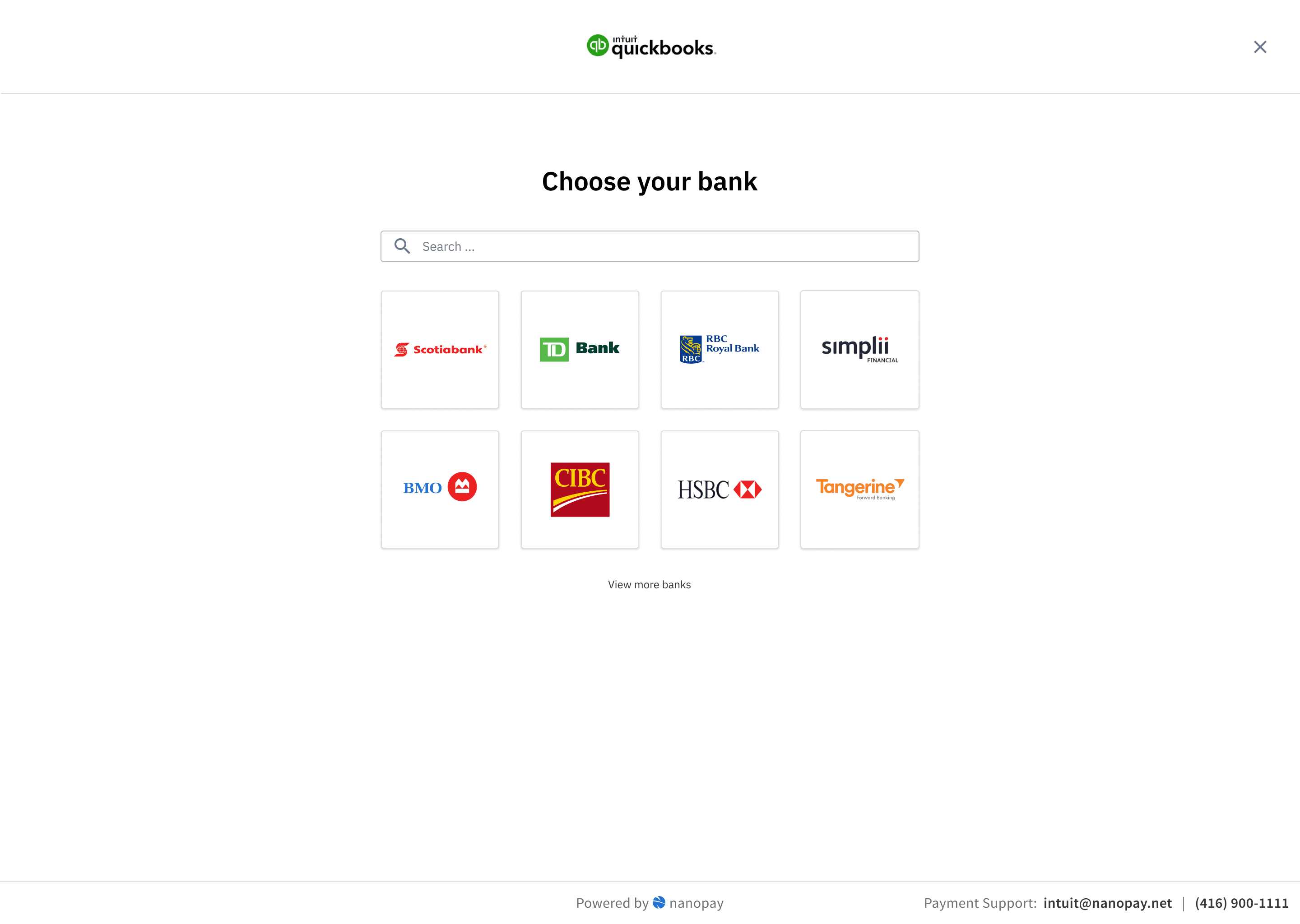
The Initial Flow
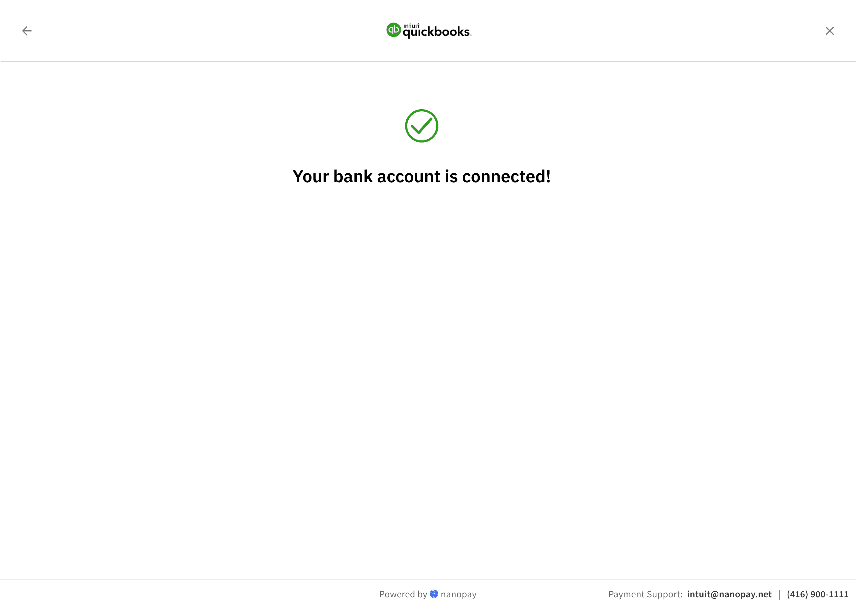
The base experience: payer selects bank payments on the QuickBooks invoice, authenticates via the third-party service, Flinks, by logging into their bank, account details are fetched, payment is submitted. In the best case, that's three steps and it's done.
Early analytics were not great. Unique conversion rate across invoices was 30%. That's a significant drop-off for a flow that, when it worked, users described as just as easy as using a credit card.
User interviews showed the problems users were facing:
"I would enter their banking information and all of a sudden their banking information would disappear so I would have to back out and re-enter it. Having to do that the second time doesn't really inspire confidence."
"If it's not instantaneous I'm not waiting. Even if it's prompting 1-2 minutes, I just get used to refreshing if I have to wait that long."
The third-party connection had reliability issues we couldn't fix directly.
Short-Term Fixes
I designed two fixes that would get us some gains in the short-term. First, users could retry a failed login attempt instead of hitting a dead end and abandoning. Second, we added explicit progress feedback during the data-fetching step so users knew it was still working rather than staring at a static screen.
The Manual Fallback Flow
The bigger problem was what happened when the data retrieval failed entirely. We needed the payer's account and transit number to complete a bank payment. Most Canadian users don't have those memorised. When the third-party fetch failed, we had no way to collect that information, and the payer had nowhere to go.
If the connection fails, the payer can enter their details directly. The challenge was that most users genuinely don't know where to find their account and transit number. I designed a walkthrough that showed them how to locate that information on a void cheque, with visual guides for the major Canadian banks showing exactly where each number appears.
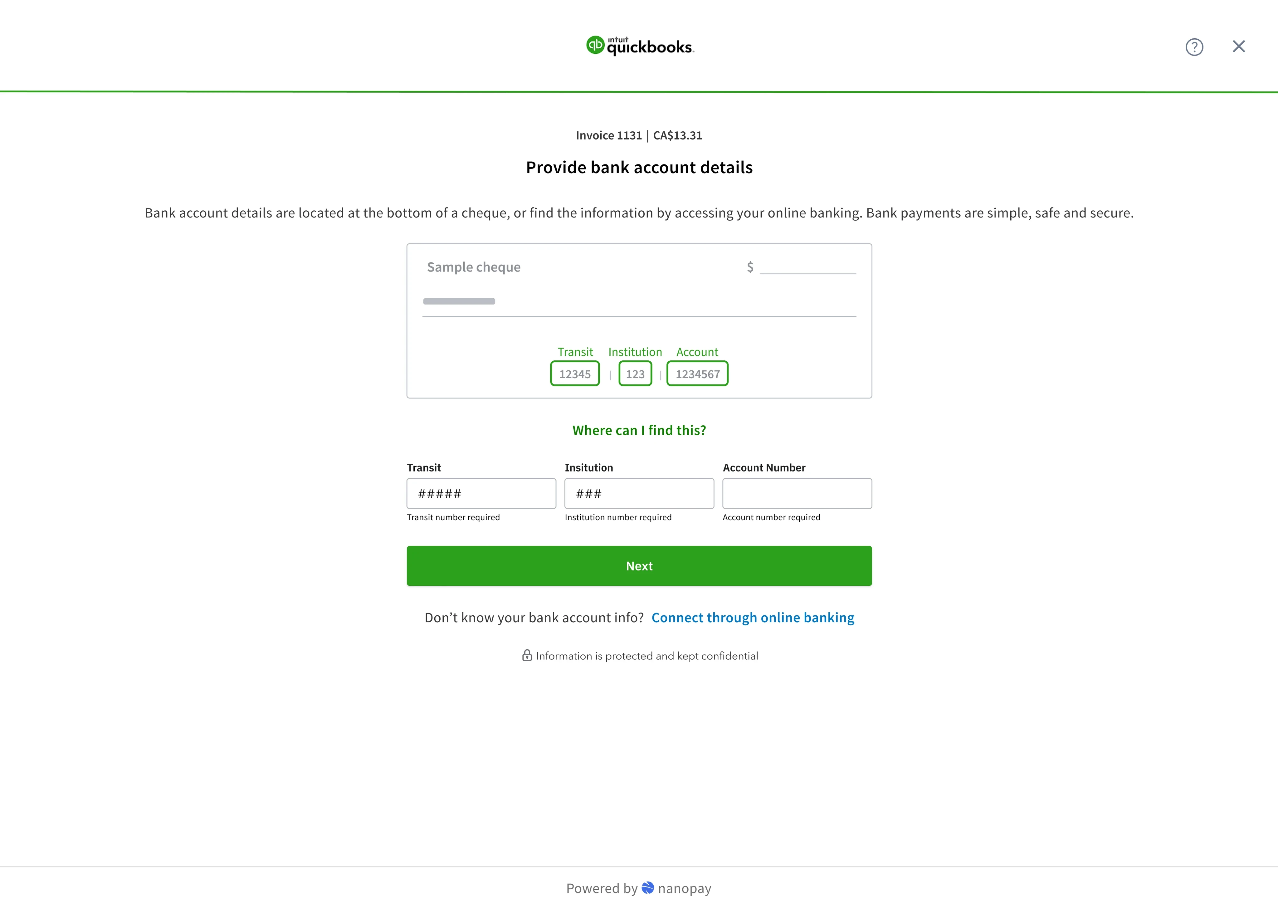
Users responded to the void cheque reference well in testing. Having a visual diagram that clearly showed where to look removed the uncertainty, and watching their details validate in real time gave them confidence the payment would go through.
result.
The two short-term changes, retry logic and progress feedback, pushed unique conversion up by 20%. Conversion for the target segment, B2C payers above the $3,000 Interac cap, was higher still. The manual fallback was in testing when the project wrapped.
The next planned phase was saving payment information so payers wouldn't need to re-enter details on future invoices. That would have addressed repeat-use friction, which I expected to matter more than first-use friction once volume picked up.
What I'd do differently
I'd have pushed earlier to understand the third-party reliability metrics before finalising the initial design. We designed for the happy path and discovered the failure rate through analytics rather than upfront research. The retry state and progress feedback were obvious in retrospect. And the trust questions around nanopay's brand visibility in a QuickBooks payment flow were something I should have flagged in the design brief, not discovered in testing.

